한편 나는 갑자기 이번에 준비하게 된 색조제품뿐만 아니라, 회사의 가장 중요한 메인제품의 브랜드 네임을 뷰티끄(Beautique)로 결정하였다. 중국에 오기 전 전문 브랜드 컨설팅 회사를 통해 몇 개의 후보 군을 만들어 왔었는데, 그 중 뷰티끄가 상표검색 결과 중국에서 브랜드 등록 가능성이 제일 높은 것이었으며, 그 의미와 느낌도 보편적인 중가 브랜드이지만 고급스런 한국제품 및 매장이라는 컨셉에 적합할 것이라 생각했기 때문이었다.
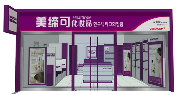
뷰티끄는 화장품의 뷰티(Beauty)와 고급 의류매장을 의미하는 부띠끄(Boutique)를 합성해서 탄생된 이름이다. 중국어 브랜드명은 메이디커(美締可, 미체가)로써, 뷰티끄의 중국식 발음과 유사하게 하는 한편, 뷰티의 의미를 담고 있는 아름다을 ‘美’를 활용한 것으로, 그 의미를 직역하면 아름다움을 체결해 준다, 즉 아름답게 만들어 준다는 뜻이다.
나는 처음부터 우리회사의 의료기 이미지를 화장품에서 지우기 위해, 태평양의 아모레처럼 우리회사의 메이디커를 단순히 하나의 브랜드를 벗어나, 회사를 대표하는 모(母)브랜드로 키우기로 작정하고, 회사 이름이 아닌 메이디커를 간판 명으로 정했다. 따라서 앞으로 중국 전역의 모든 점포에는 회사명이 아니라 메이디커 화장품이 간판으로 걸려 널리 퍼지게 될 것이다.
또한 나는 메이디커의 브랜드 칼라를 우아하고 고귀한 왕족의 색이며, 중국인들도 좋아하는 짙은 보라색으로 결정하고, 간판부터 시작해서 모든 CI(Corporate Identity)와 BI(Brand Identity)를 모두 보라색으로 통일하게 하였다. 그 때문에 이곳 광저우에서도 보라색 칼라와 이미지에 맞는 중가대의 색조용기를 찾아 헤매었는데. 여전히 마땅한 용기를 찾지 못하고 있는 중인 것이다.
문제는 용기와 업체를 선정하는 나의 기준과 관점이 함께 온 두 명의 중국인 아가씨들과 너무도 달랐기 때문이다. 나의 관점은 색조 아이템마다 용기 디자인의 아이덴티티(Identity)를 중요시 하였으며, 업체는 생산공장을 가지고 있는 건실한 회사여야만 했다. 메이크업베이스, 팩트, 아이섀도우, 립글로스, 마스카라, 아이라이너, 페이스 칼라 등 총 7품목을 개발해야 하는데, 각각의 품목별로 업체가 다르고 디자인의 통일점이 없으면, 하나의 브랜드로 BI를 형성하기 어려울 뿐만 아니라, 다양한 부자재 업체를 관리하기도 힘들기 때문이다.
반면 서이사와 카이는 무조건 이쁘면 됐다. 내가 아무리 내 관점을 얘기해도 그녀들의 대답은 “안 이뻐요”라면 그만이었다. 반면 그녀들이 이쁘다고 보여주는 것들을 보면, 어떤 품목은 사각이고 어떤 건 원형의 형태로, 내가 수용할 수 없는 중구난방의 모양들이었으니, 가뜩이나 다양하지 않은 색조용기 시장에서 우리 모두를 만족시키는 용기를 선정한다는 것은 너무도 힘든 일이었다.
그렇게 약 두 시간 동안 호텔 방에서 혼자 일하고 있는 사이에 싱파광장에 남기고 왔던 두 사람이 기쁜 얼굴로 들어왔다.
“상무님, 좋은 용기를 찾았어요.”
내 방으로 들어오자 마자 서이사는 가방 한 가득 용기 견본을 침대 위에 쏟아져 붇듯이 펼쳐 보이며 말했다.
“단가도 싸고, 용기도 이쁘고, 그리고 그 무엇인가… 통일성도 있으며…. 업체도 한군데에서 모두 관리하는 것이에요.”
“오~ 그래? 어디 봅시다~”
내가 보기에 용기도 슬림하니 이쁘고, 그녀가 보여 준 단가도 지금까지 견적 받은 곳보다 더 싼 게 좋아 보였다.
“흠~ 겉 모습은 그럴 싸 하지만 마무리가 너무 조악하네. 여기 거울 붙인 곳을 봐. 거울 옆면을 연마하지 않아서 너무 날카롭잖아. 그리고 이거 버튼이 조금만 쓰면 고장 날 것 같아. 이런 건 보완이 가능할까?”
순간 서이사가 짜증 섞인 말투로 대답하였다.
“이제 이거 아니면 더 이상 안돼요. 이것도 상무님만 OK하시면 지금 빨리 다시 가서 최종 결정을 해야만 됩니다. 비행기 시간이 얼마 안 남았으니 빨리 결정해 주세요.”
나는 서이사의 재촉에 하는 수 없이 대답을 하였다.
“휴~ 중국 것은 이상하게 2%가 부족하단 말이야. 이런 뒷 마무리만 잘해도 제품이 훨씬 더 좋아 보일텐데… 그럼 이렇게 하자. 약간의 단가가 조금 올라도 좋으니, 내가 말한 부분들을 다 보완하는 조건으로 이 제품들로 결정하자. 얼른 가서 다시 세부 견적 받아 오세요.”
“워쯔다오(我知道)~”
나의 말에 서이사와 카이는 알겠다며 짧게 대답을 하고, 용기들을 순식간에 주어 담고는 뛰다시피 방을 빠져 나갔다. 나는 관연 이 일이 잘하는 일인지 걱정 반 안심 반 하며 주섬주섬 일을 마무리하고 떠날 채비를 하며 생각하였다. ‘어차피 베이징 K사가 위생허가 받을 때까지는 저 용기들을 바로 사용하지는 않을 것이니, 일단 저걸 가지고 돌아가서 그래픽 디자인을 다시 해보고, 또 비슷한 용기가 있는지 인터넷으로 좀 더 알아보고 심사숙고해서 결정하면 되겠지.’ – 계속 –
—————–
During this trip, I suddenly decided not only to prepare for the new color cosmetic line but also to finalize the brand name for the company’s main product as “Beautique.” Before coming to China, I had worked with a professional brand consulting firm to create a few name candidates, and among them, Beautique had the highest potential for trademark registration in China. Moreover, the meaning and tone of the name fit perfectly with the brand concept — a mid-range yet premium Korean product and store image.
The name Beautique is a blend of Beauty and Boutique, symbolizing both beauty and a sophisticated retail experience. Its Chinese brand name, Meidike (美締可), was chosen to resemble the phonetic sound of Beautique while incorporating the character 美 meaning “beautiful.” Literally translated, it means “to seal in beauty” or “to make beautiful.”
From the beginning, I aimed to eliminate any lingering medical-device image associated with our company in the cosmetics business. Just as Amorepacific uses Amore as its mother brand, I decided to grow Meidike beyond a single product line into the company’s representative brand. Therefore, instead of the company name, the store signs across China would display “Meidike Cosmetics”, spreading brand awareness nationwide.
I also chose deep purple as the brand’s signature color — a noble, royal shade favored by Chinese consumers as well. From the signage to all CI (Corporate Identity) and BI (Brand Identity) designs, everything would be unified in this purple tone. Because of that, even here in Guangzhou, I searched tirelessly for color cosmetic packaging that matched the purple image and suited a mid-range brand identity. Yet, I still couldn’t find anything satisfactory.
The main problem was that my standards and perspectives for selecting containers and suppliers differed sharply from those of the two Chinese female colleagues who accompanied me. My approach emphasized the design identity of each cosmetic item and required that suppliers be reliable companies with their own production facilities. Since we needed to develop seven items — makeup base, compact powder, eyeshadow, lip gloss, mascara, eyeliner, and face color — each with potentially different suppliers, maintaining a consistent design language across all products was essential. Otherwise, it would be difficult to build a unified BI or manage multiple subcontractors efficiently.
In contrast, Director Seo and Kai cared only about how “pretty” the packaging looked. No matter how much I tried to explain my reasoning, their responses were the same: “It’s not pretty.” Yet when they showed me what they considered pretty, the shapes were inconsistent — some square, others round — lacking any cohesive design concept. Given the limited selection in the color cosmetic packaging market, finding containers that satisfied all of us was nearly impossible.
While I was working alone in my hotel room for about two hours, organizing tasks and replying to emails, the two women returned from Xingfa Plaza with bright expressions.
“Manager, we found great containers!” Seo said excitedly as she entered the room, dumping a bag full of sample containers onto the bed.
“They’re cheap, pretty, and somehow have a unified design. Plus, the supplier can handle everything in-house.”
“Oh? Let’s have a look,” I said.
At first glance, the containers looked slim and elegant, and the quoted prices were lower than those we had seen before.
“Hmm… They look decent, but the finishing quality is rough. Look here — the mirror edge isn’t polished, it’s sharp. And this button seems fragile; it could break easily. Can these issues be fixed?”
Seo replied in an irritated tone, “If we don’t go with this, we have no other options. If you approve it now, we can go back immediately to finalize the deal. Our flight is soon — please decide quickly.”
Feeling pressed, I sighed and said,
“Ah… Chinese products always seem to fall short by about two percent. If only they’d pay more attention to these finishing touches, the quality would improve so much. Alright then — let’s proceed on the condition that they fix the issues I mentioned, even if it slightly raises the cost. Go back and get the revised quote.”
“Wǒ zhīdào (我知道)~,” Seo and Kai replied briskly, scooping the samples back into the bag and rushing out of the room.
Left alone again, I couldn’t help but feel both anxious and relieved at once. As I packed up my things, I thought,
“Well, since Beijing K Company won’t be ready to obtain hygiene approval for a while, we won’t need to use these containers immediately anyway. I’ll take them back, review the graphic design, check online for similar options, and make a final decision after thorough consideration.”
— to be continued —