

한국의 화장품 시장은 이제 K-Beauty라는 이름과 함께 전세계로 뻗어가고 있다. 특히 화장품 중소기업들은 국내시장의 치열한 경쟁 속에서 살아남기가 힘들어. 이미 오래전부터 해외시장으로 눈을 돌려오고 있는 형편이다. 그런데 브랜드 네임이 너무 한국적이면 어떻겠는가? 외국인이 발음하기도 쉽지 않고, 브랜드의 콘셉트를 이름만 듣고 이해하긴 쉽지 않을 것이다. 그래서 나는 가급적 영어로 브랜드 네임을 짓기를 권장하며, 설령 한글로 짓더라도 받침이 없이 발음하기 쉬운 이름이면 좋을 것이다.
브랜드에는 경계는 없지만 누구나 글로벌 진출이 바로 이루어지는 건 아니다. 먼저 국내에서 브랜드의 역량을 강하게 집중하여 작은 성공을 한 후, 그 브랜드의 힘을 글로벌화에 활용해야 한다. 한 나라에서 성공한 브랜드는 전세계적으로도 성공할 가능성이 높다. 카테고리 측면에서도 스위스 시계, 프랑스 와인, 독일 자동차 등을 보면 국내의 성공이 세계적 성공을 가져옴을 알 수 있다.
10여년 전부터 K-POP과 K-Drama에 힘을 받아온 한국 화장품은 최근 K-Beauty 대신 K-Food에게 자리를 내어준 것 같다. 하지만 기술은 쉽게 바뀌어도 사람의 마음 속에 깊게 자리잡은 문화의 힘은 그렇게 쉽게 바뀌지 않는다. 다시금 글로벌 K-Beauty가 다시 비상할 날이 올 것이다.
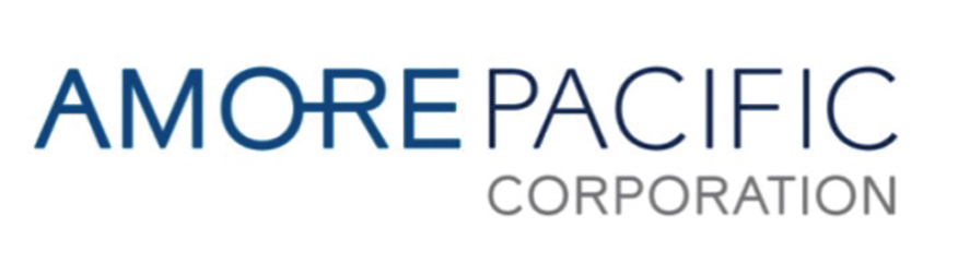
그래서 브랜드 네임을 영어로 짓는 게 유리하다. 한국의 대기업도 글로벌을 위해 회사명을 LG, SK, CJ 등의 영문 약어로 지었고, 화장품업계의 태평양은 아모레퍼시픽으로 이름을 바꾼 이유이기도 하다.

또한 소비자들에게 가시적으로 보여주는 브랜드 로고도 세계적으로 통용되는 이미지로 형상하는 것이 좋다. 브랜드 로고는 인간의 눈이 두 개인 것에 맞게 수평적으로 가로로 넓은 모양이 좋으며, 보통 양쪽 눈에 맞추어 가로세로 비율이 2.25:1 정도로 디자인되는 게 좋다. 세로로 길쭉한 로고타입이 가로로 된 것보다 가독성이 떨어져서 불리하다. 그런 점에서 글자체도 제품의 컨셉을 아름답게 표현하기 위해, 가독성을 떨어뜨리는 무리수를 두면 안된다. 중요한 건 고객들이 쉽게 인식하기 위한 것이다.
마지막으로 브랜드를 표현하는 색상도 중요하다. 코카콜라가 무려 130여 년 동안 브랜드 고유의 컬러인 빨간 색을 꾸준히 사용해온 것도, 사람들이 코카콜라를 마시고 싶을 때마다 빨간 색을 찾으면 쉽게 코카콜라를 발견할 수 있도록 아이덴티티를 형성한 결과이다. 일반적으로 붉은 색은 힘과 열정을 나타내며, 반대로 파란 색은 차가움, 안정성을 나타낸다. 그런 점에서 전 세계 국기의 45%가 빨간색을 쓰며, 20%가 파란색을 사용하고 있다고 한다. 우리나라의 경우도 전자업계의 두 맞수인 LG가 빨간색을 사용하는 반면, 삼성은 파란색을 사용하고 있다. 또한 네이버에서 초록색을 사용하고 있는데, 초록은 환경과 건강에 좋은 이미지를 가지고 있다.
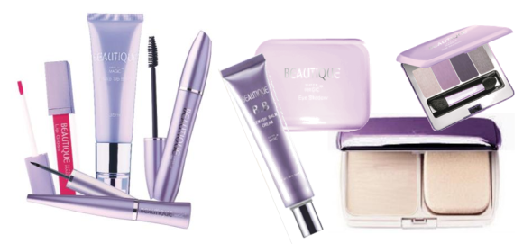
2010년 나는 중국에서 처음 출시한 화장품 뷰티크(Beautique) 브랜드에 보라색을 채택하였다. 그 이유는 보라색이 중국인이 선호하는 색상이면서 고귀함, 충성심(Loyalty) 등의 좋은 이미지를 가지고 있기 때문에, 간판 브랜드인 뷰티크에 브랜드 로열티를 강화하고자 했기 때문이었다.

또한 유산균화장품에는 주황색을 선택하였다. 유산균으로 잘 알려진 요쿠르트의 이미지를 차용하고 눈에 확 띄어 보이게 하기 위해서였다. 이처럼 브랜드에 맞는 하나의 색상을 통해 이미지를 통일하는 것 또한, 브랜드 네임에 브랜드 아이덴티티를 형성하는데 매우 중요한 전략일 것이다.
브랜드 네임은 창의적이고 콘셉트에 적합하며, 소비자 취향에 맞게 발음하기, 듣기, 쓰기, 기억하기 쉽게 개발되어야 하는데, 특히 듣기 좋아야 한다. 소비자의 마음은 귀로 듣는 소리에 더욱 잘 움직인다. 눈으로 보는 시각적 이미지는 1초 후면 기억에서 사라지지만, 귀로 들은 것은 약 4~5백배나 기억에서 지속되기 때문이다.
——————————————-
The Korean cosmetics market, now recognized globally as K-Beauty, is expanding worldwide. However, small and medium-sized cosmetics companies in Korea face intense competition domestically, making it challenging to survive. Therefore, these companies have long turned their attention to overseas markets.
One of the critical considerations when expanding globally is the brand name. If the brand name is too Korean, it may be difficult for foreigners to pronounce and understand the concept just by hearing it. Hence, it is advisable to name the brand in English. Even if it is named in Korean, it should be easy to pronounce, preferably without complex consonants.
Although there are no borders for brands, not everyone can immediately succeed globally. It is crucial to first achieve small successes domestically by concentrating on building a strong brand, then leveraging that brand strength for global expansion. A brand that succeeds in one country has a higher chance of succeeding globally. For example, Swiss watches, French wines, and German cars all started with domestic success before achieving global recognition.
Although K-Beauty seemed to have ceded its place to K-Food recently, the deep cultural influence driven by K-POP and K-Drama for over a decade indicates that the global resurgence of K-Beauty is inevitable. Therefore, naming the brand in English is advantageous. Korean conglomerates have also named themselves with English abbreviations for global expansion, such as LG, SK, and CJ. The same logic applies to Amorepacific in the cosmetics industry, which rebranded from its original name Taepyeongyang.
Moreover, the brand logo should also be universally recognizable. It should be horizontally aligned to match the human eye’s natural perception, with an ideal width-to-height ratio of about 2.25:1. Vertically elongated logos tend to be less readable. The font should beautifully express the product concept without compromising readability. The key is to make it easily recognizable by customers.
Color is another crucial aspect of brand identity. For instance, Coca-Cola has consistently used red for over 130 years, making it easy for customers to identify the brand when they crave it. Red generally symbolizes strength and passion, while blue signifies coolness and stability. Many national flags incorporate red (45%) and blue (20%) for these reasons. In Korea, LG uses red, Samsung uses blue, and Naver uses green, representing a healthy and environmentally friendly image.
In 2010, I launched the Beautique brand in China with purple, a color favored by the Chinese that symbolizes nobility and loyalty, aiming to strengthen brand loyalty. For a lactic acid bacteria-based cosmetic line, I chose orange to evoke the image of yogurt and make the product stand out. Thus, using a consistent color aligned with the brand image is a vital strategy for forming a strong brand identity.
Brand names should be creative, concept-appropriate, and easy to pronounce, hear, write, and remember, particularly focusing on auditory appeal. Consumers are more influenced by what they hear, as auditory memory lasts 400-500 times longer than visual memory.